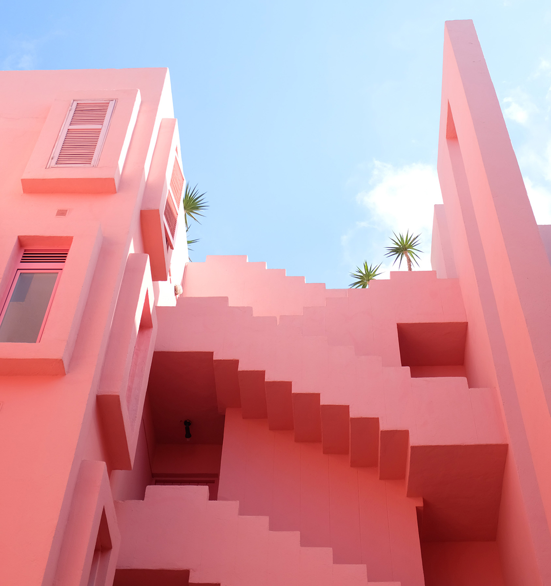
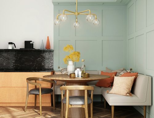
Colour theory matters, whether you’re an artist or not! We’re all vaguely familiar with the rainbow colour wheel we once looked at in school – this is a concept that has been developed on and revisited since Sir Isaac Newton created a circular colour diagram back in 1666.
The colour wheel is based on the Primary Colours – red, yellow and blue, these colours cannot be formed by any other combination or mixture of other colours. All other hues derive from these three primary colours; secondary colours being the result of combining each primary colour; red and yellow to make orange, yellow and blue to make green and blue and red to make purple. Tertiary colours are the colours formed when mixing primary & secondary colours and therefore always have a two-word name explaining the combination; i.e. blue-green, red-violet, yellow-orange etc.
The colour wheel makes it easy to understand ‘Colour Harmony’, these are the colours that work well together. Analogous colours are any three colours that are next to each other on a 12-part colour wheel, such as yellow-green, yellow, and yellow-orange. Complementary colours are those opposite to one another on the wheel. These opposing colours have maximum contrast and are often used to create a striking and bold visual impact.
Colours therefore behave differently depending on their situation! For example, red on a black background stands out much more than the exact same red on a white background, the same red would disappear on an orange background yet would be intensified when used on a turquoise. When put into practice in a design setting, knowledge of colour theory can be used to create certain desired effect.
Colours have different connotations depending on context and tone. Reds are energetic and passionate; so can create both a romantic or intensive/aggressive statement. Yellow can be warming and rustic or playful and bold. Greens are often associated with nature and relaxation whilst blues can be both serene and calming or cool and striking.


