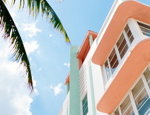
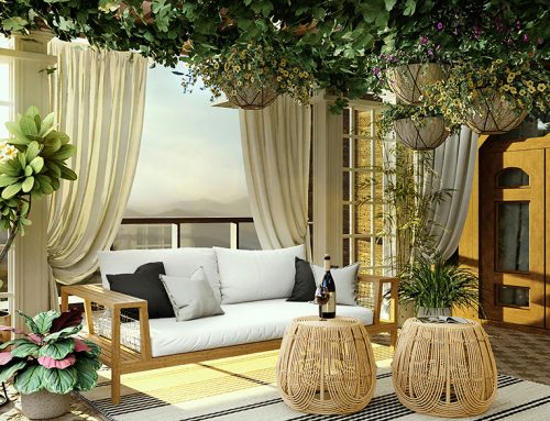
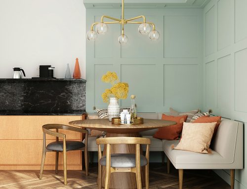
This week we’re thinking about hot colour palettes to add a little bit of heat to your interior design scheme. Well if this week hasn’t been a little splash of summer we don’t know what has and it’s got us thinking. There is a good reason for neutral colour palettes being so popular in design schemes, however, they aren’t daring and they rarely stand out against the rest.
At Wylde Interior Architecture we love to go bold and bright with our design concepts – when our clients allow it and many of our loudest designs have been finalists and award winners. Warm colours are those around the red, orange and yellow areas of the colour wheel. In colour theory, the colour wheel is split into warm and cool tones – those that evoke images of fire/sunlight in contrast to cool tones of greens, blues and purple that are reminiscent of water and icy temperatures.
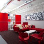
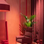
Assess the size and purpose of the room before re-designing – this is a really important part of getting the balance right. You can go as bright as you like in a space of any size, but it will change what percentage of the space is used and how it is used. Red is an ideal accent colour and if you’re feeling bold, it is a powerful colour for a feature wall. Red evokes strong emotions and can be associated with anger and passion, however it’s energising qualities make it the perfect colour for high-output spaces such as idea generating areas, gyms and communal spaces such as kitchens or games rooms.
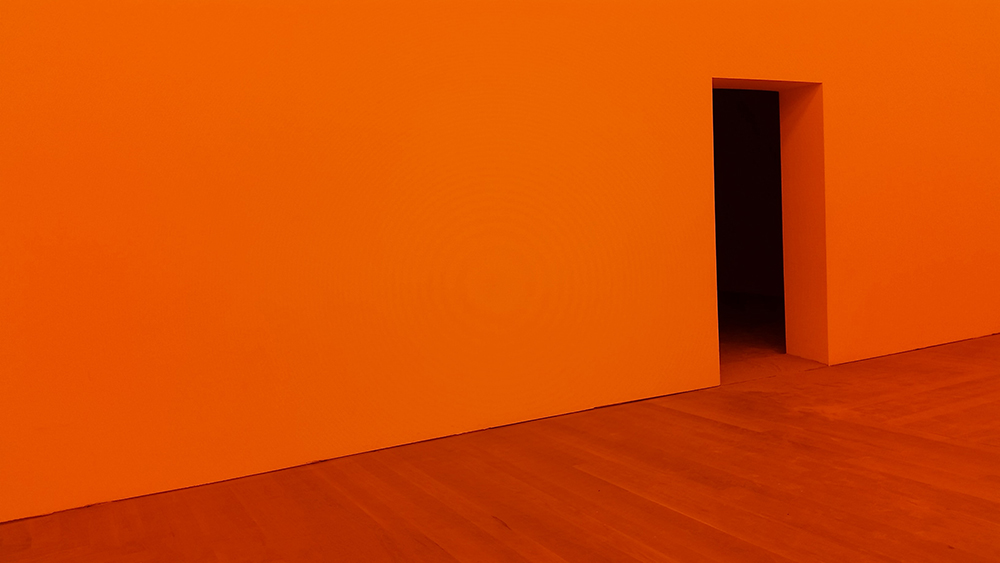
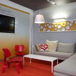
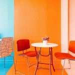
Similarly, oranges and warm yellows create a sense of energy and playfulness. Featuring bright orange in any design scheme injects a zing of fun, relaxed attitude and creativity. The brighter the shade the more pronounced the impact but more subtle results can be achieved with toned down shades and minimal use, paired with contrasting or neutralising colours such as hot orange with teal blues and reds with greys.
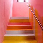
We’ve compiled a gallery of some of the brighter projects we’ve completed along with some of our favourite found design schemes that are bound to heat up your day!
- Wylde – Seco
- Wylde – KMC
- Wylde – Opus
- Wylde ia – Seco
- Wylde – MotoNovo
- Wylde ia Thatchers HQ
- BAWA

