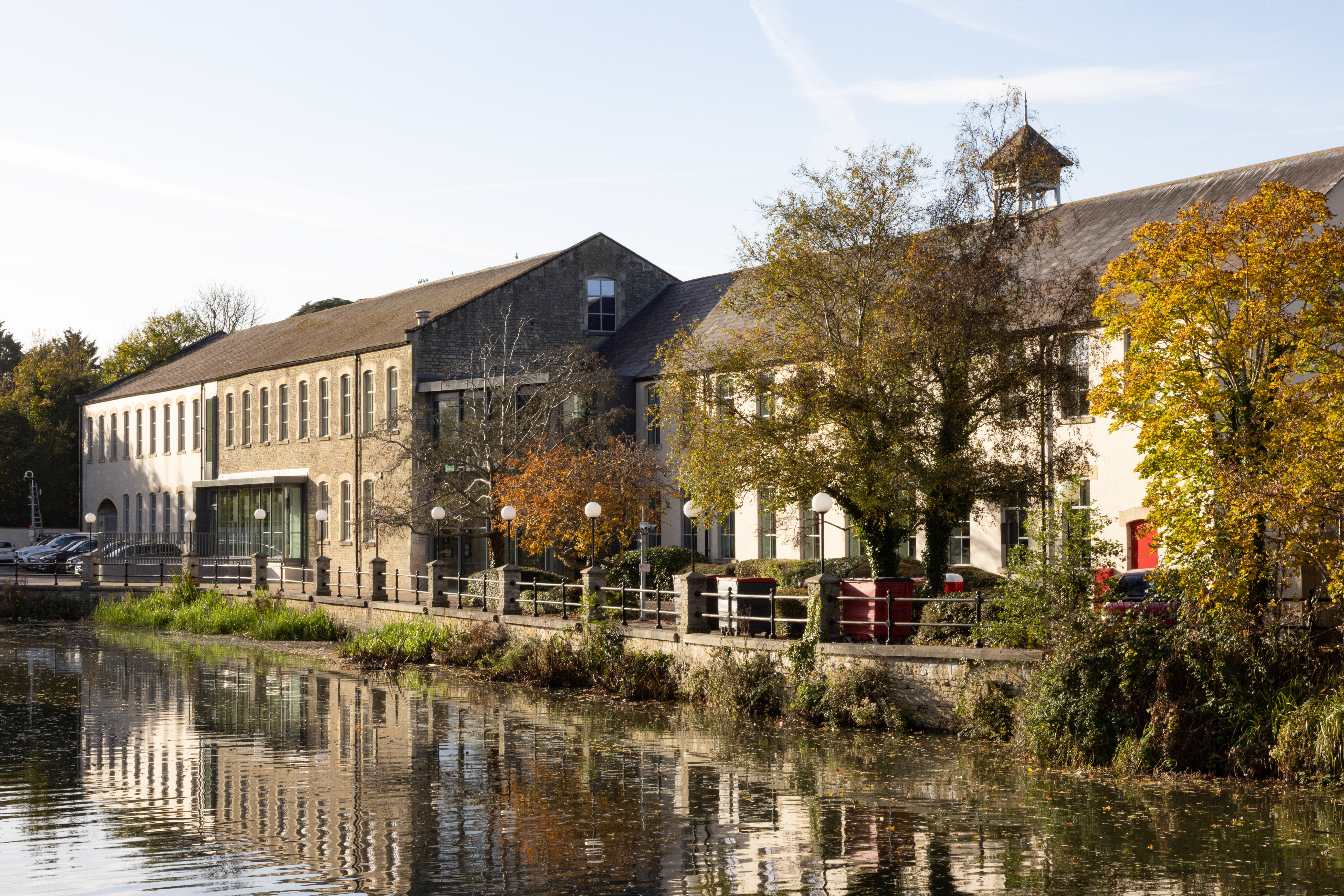
A GRADE 2 LISTED BUILDING IN THE HEART OF CHIPPENHAM
PROJECT DETAILS
Project: Alliance Pharma
Location: Chippenham, UK
Size: 1,600sqm
Value: £400k
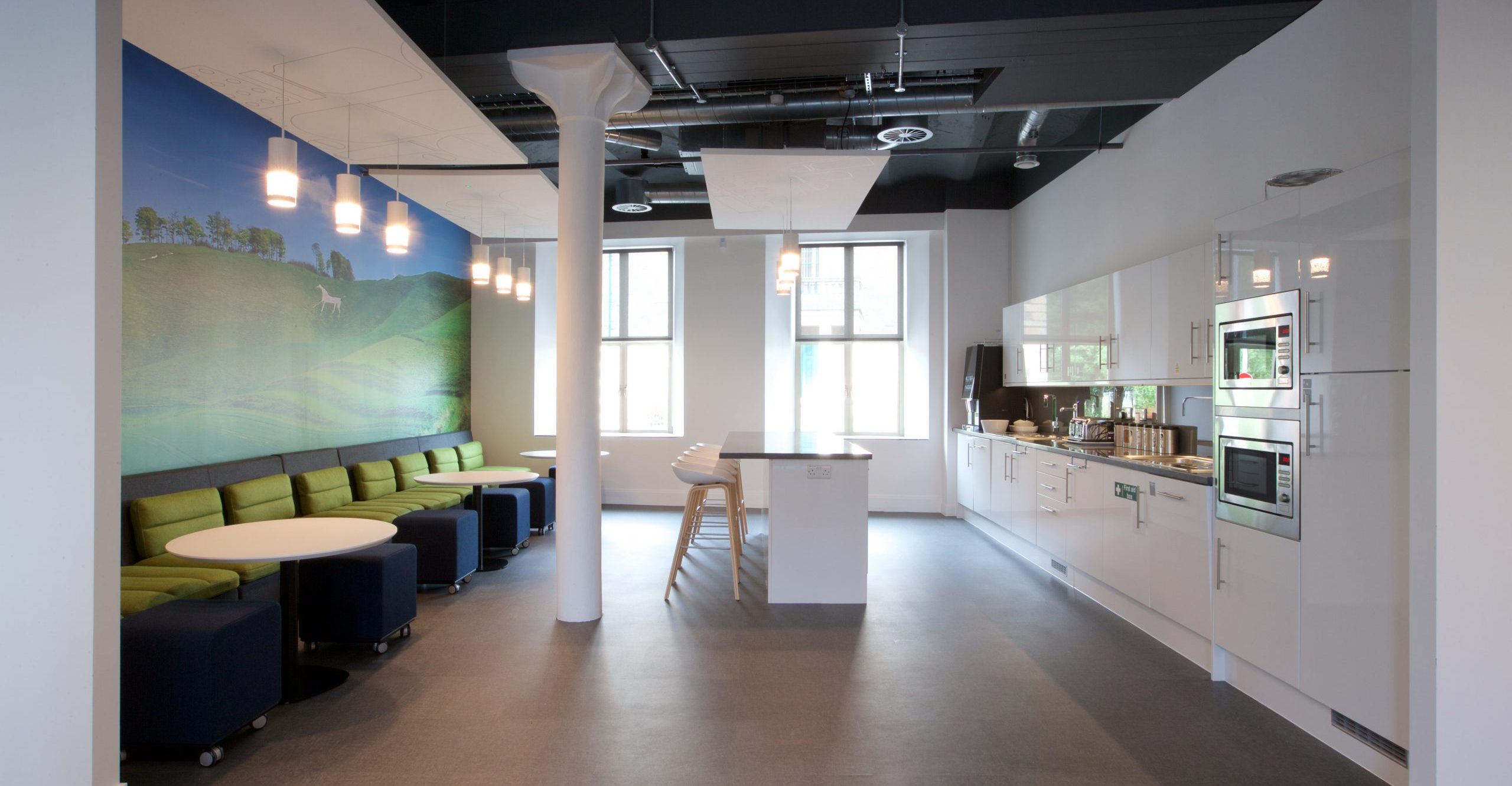
“This new design has revolutionised our staff communication and engagement – previously, teams were split up into four separate areas. Staff had to cross a central stairwell and pass through security controlled doors to reach other sections. Moving all staff to one side of the building and creating a café and breakout area has dramatically improved flow, interaction and productivity. The addition of art, creative lighting, air conditioning and soft furnishings has completely changed the feel of the space, creating an atmosphere of creativity.”
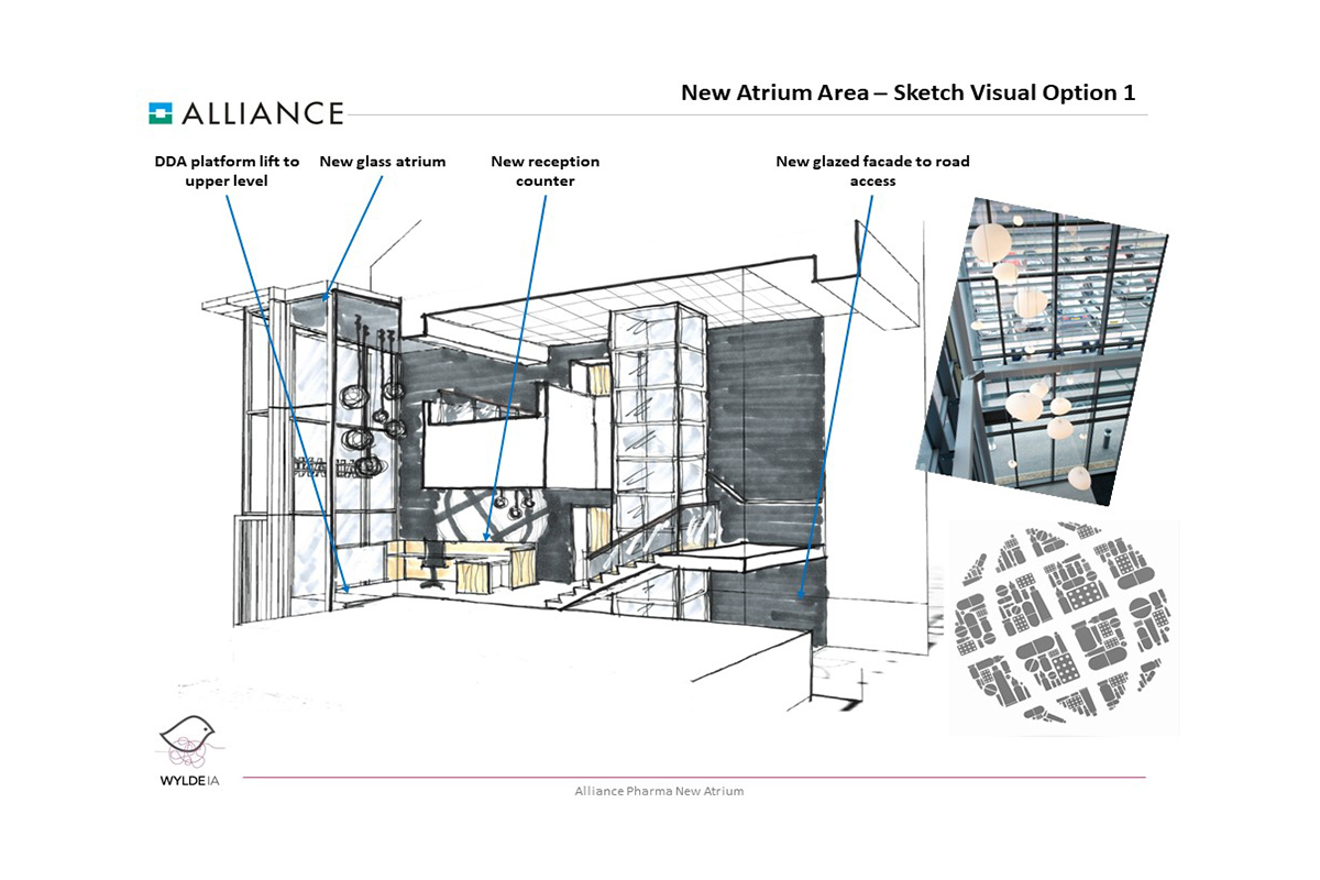
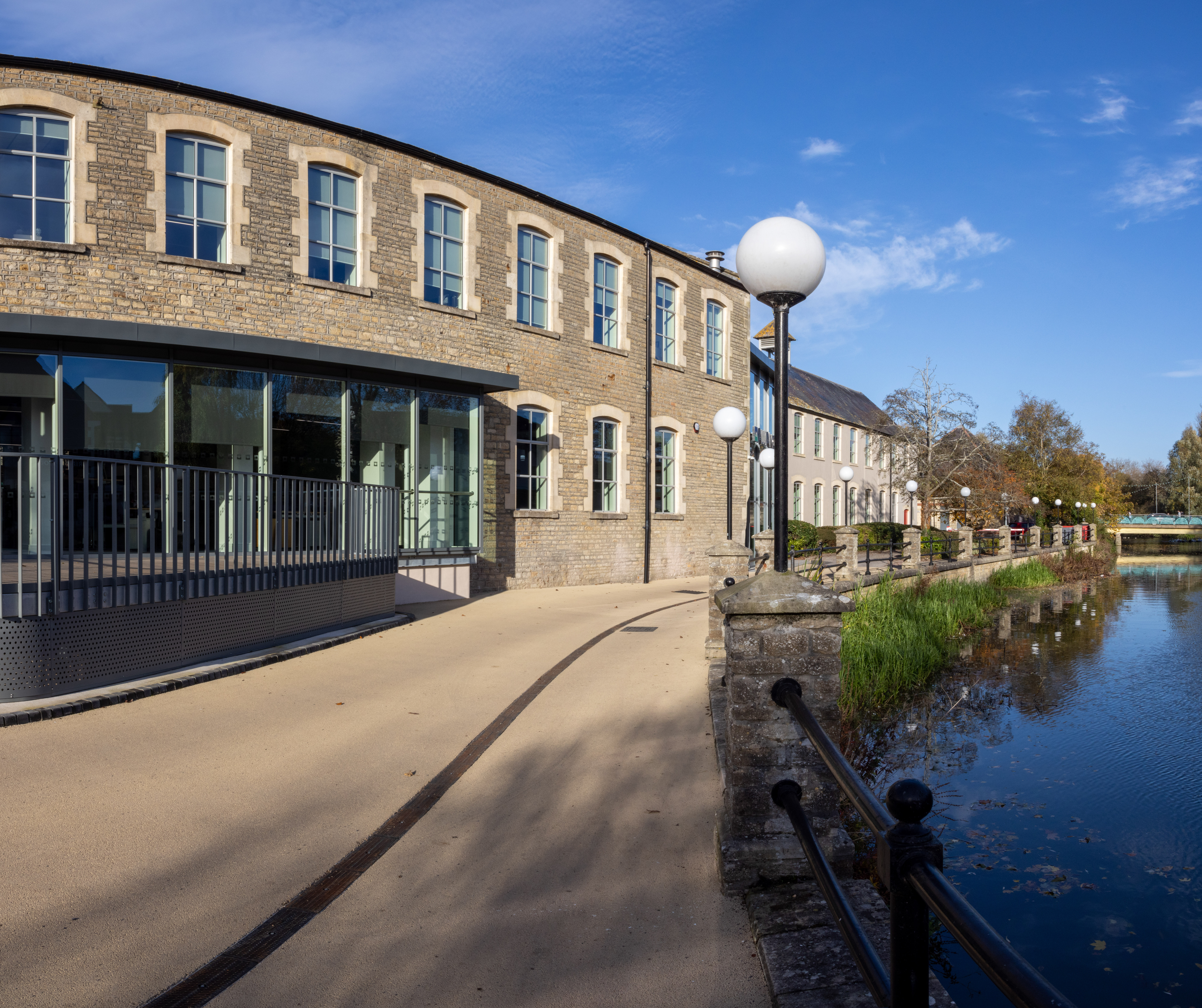
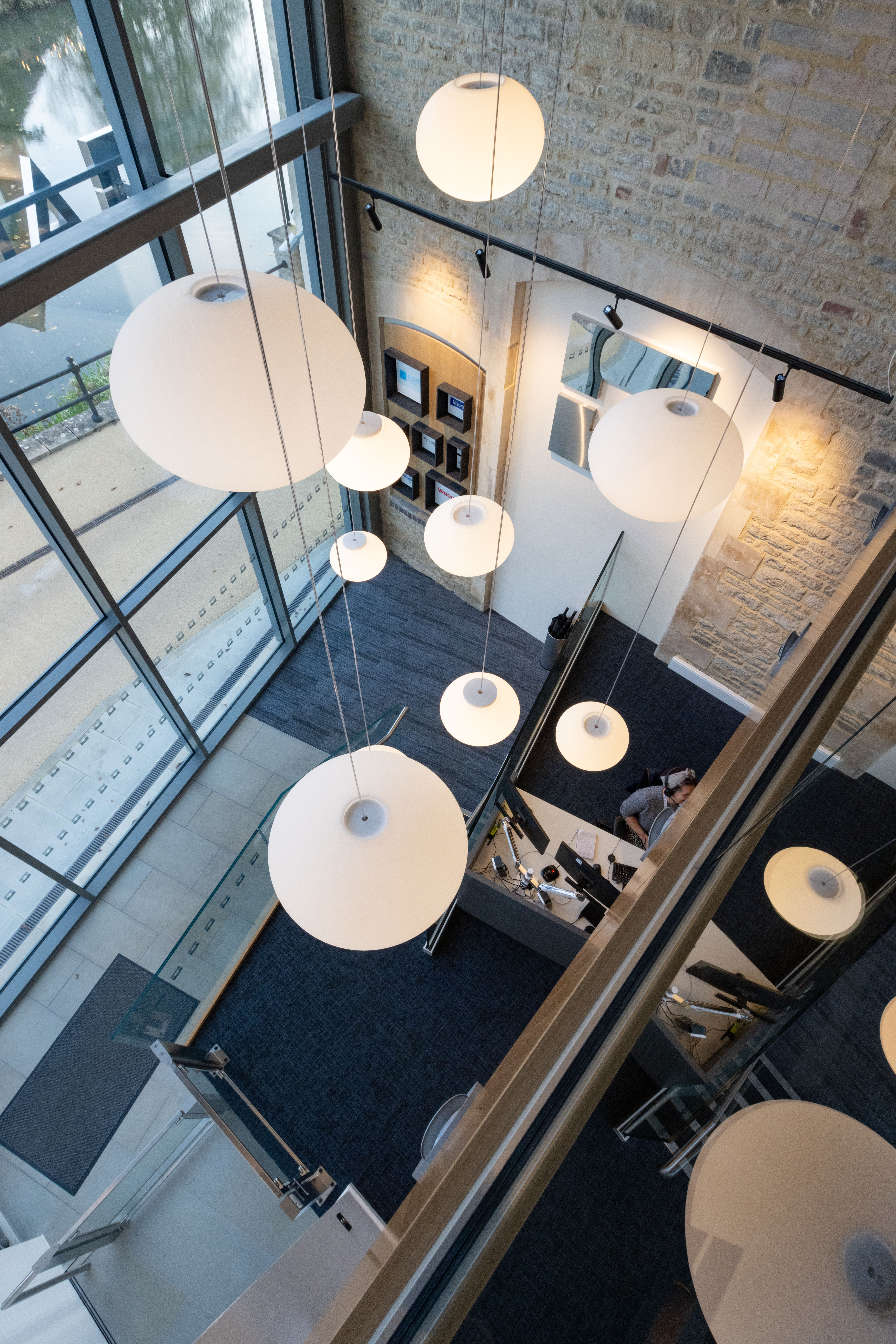
Wylde redesigned an existing space for client Alliance Pharma in Chippenham. Alliance Pharma occupy Avon Bridge House – a Grade 2 listed building in the heart of Chippenham. Wylde were approached to revamp the atrium and provide a smart professional and welcoming area. Our project involved making the reception area more professional, welcoming and setting out the Alliance brand using images and icons from their marketing material new finishes and flooring that would tie into the new ground floor wing.
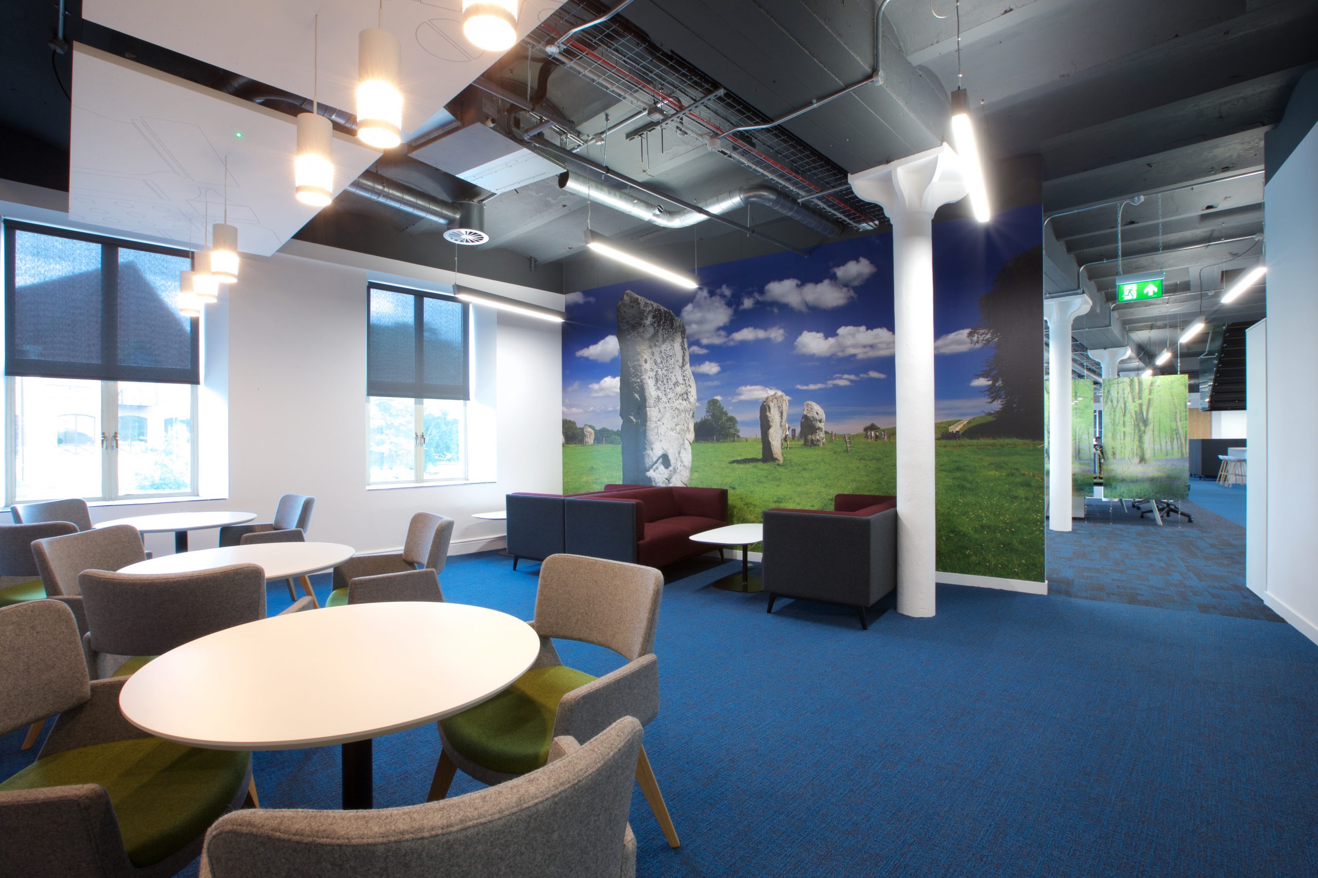
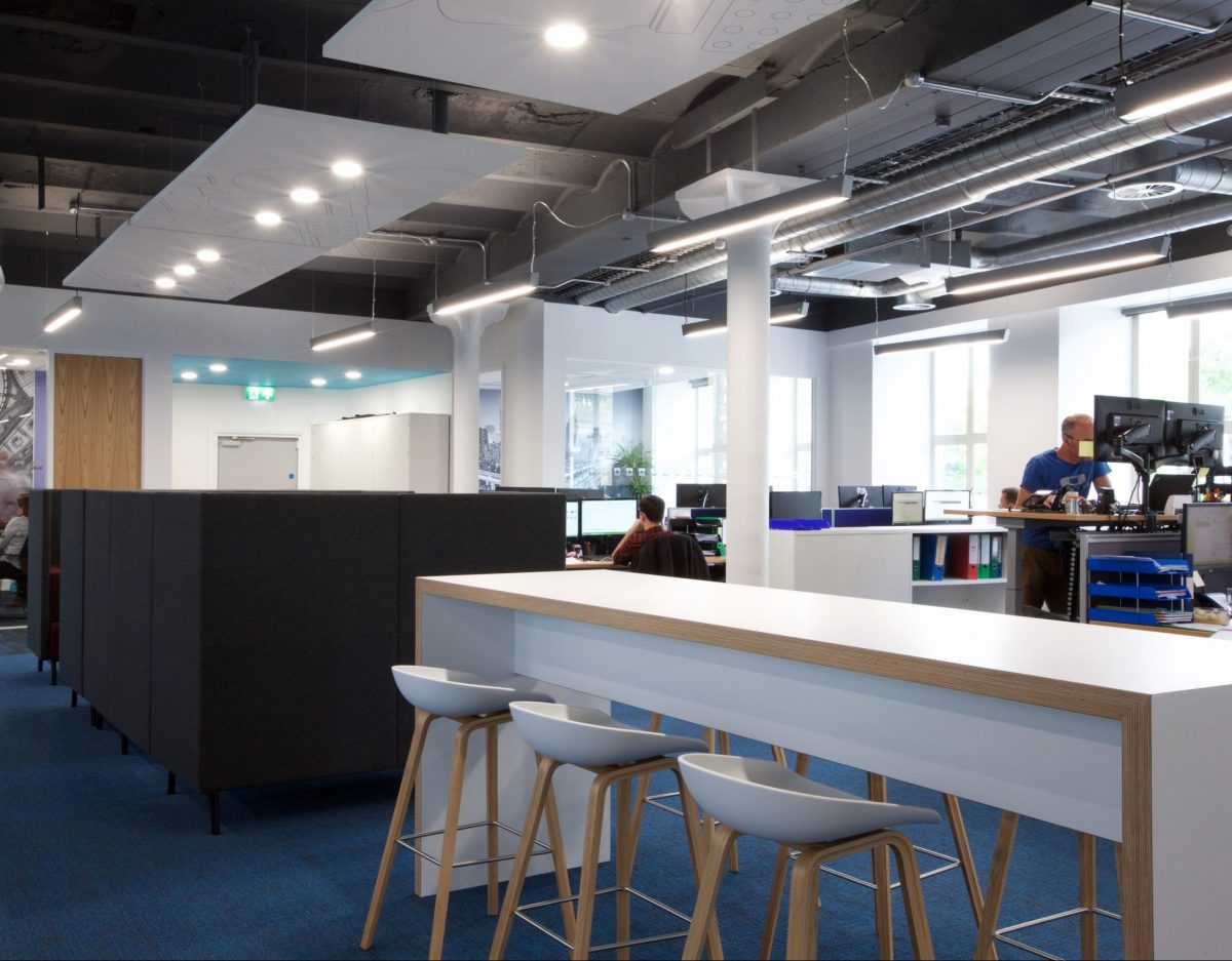
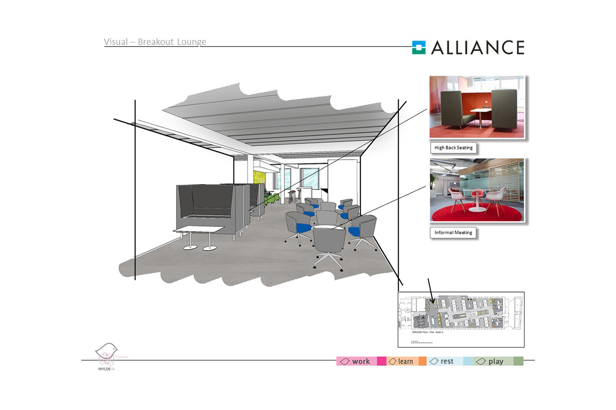
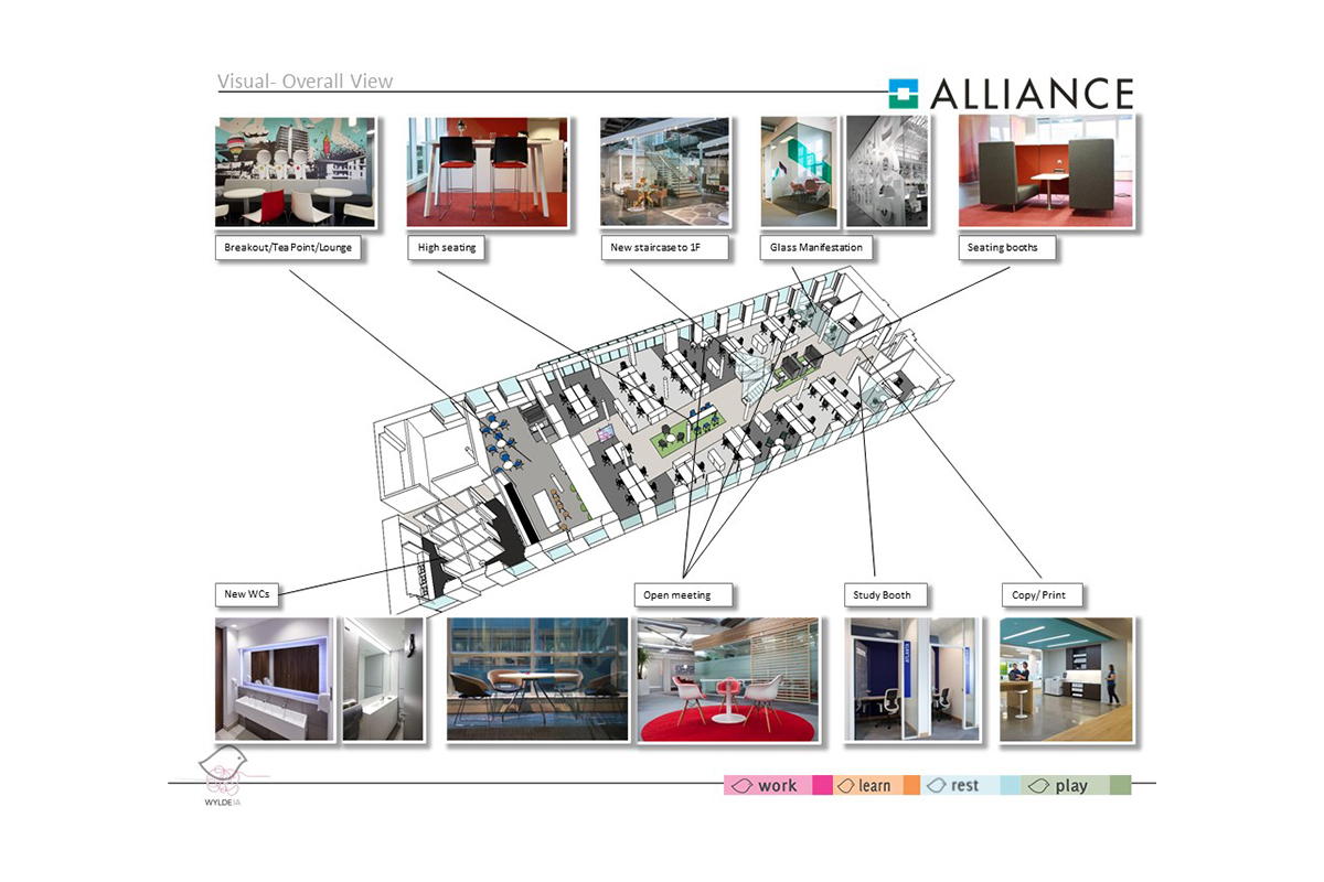
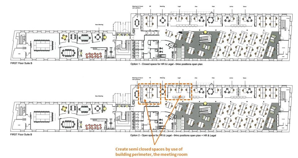
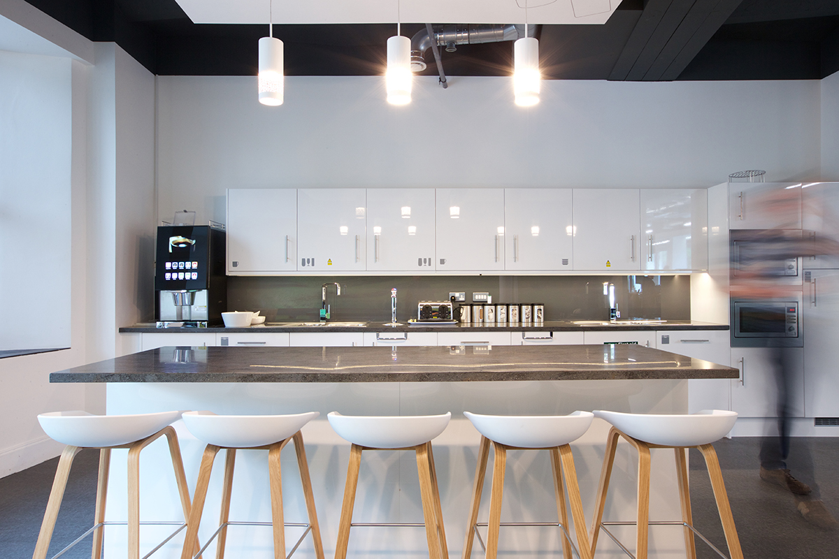
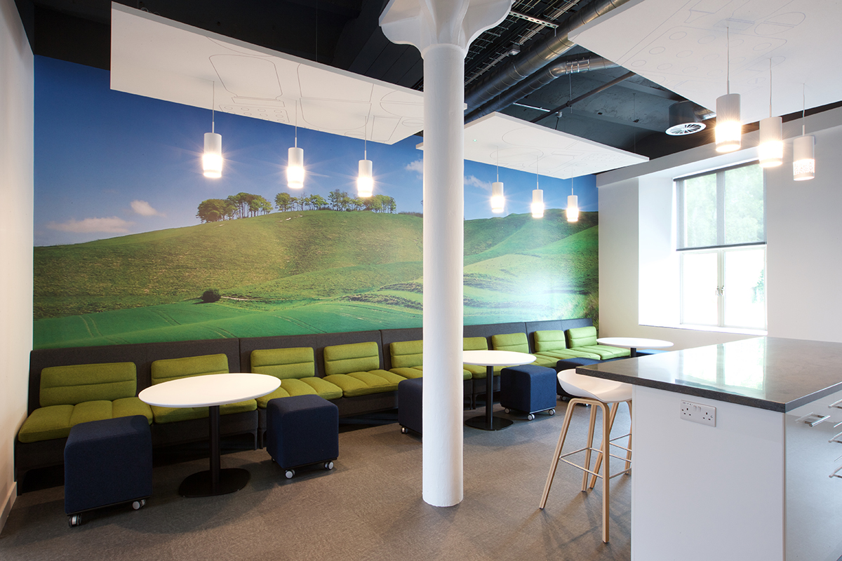
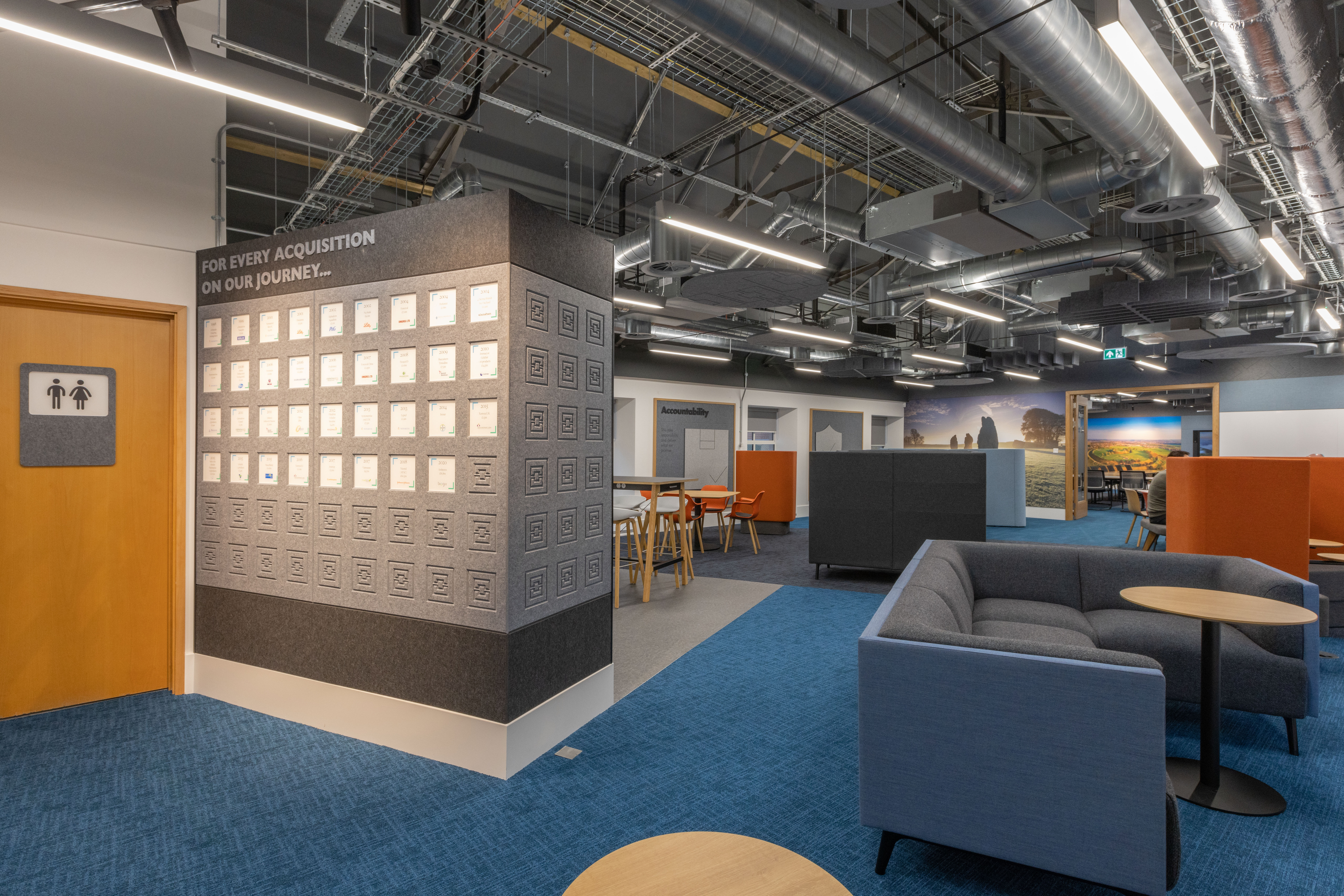
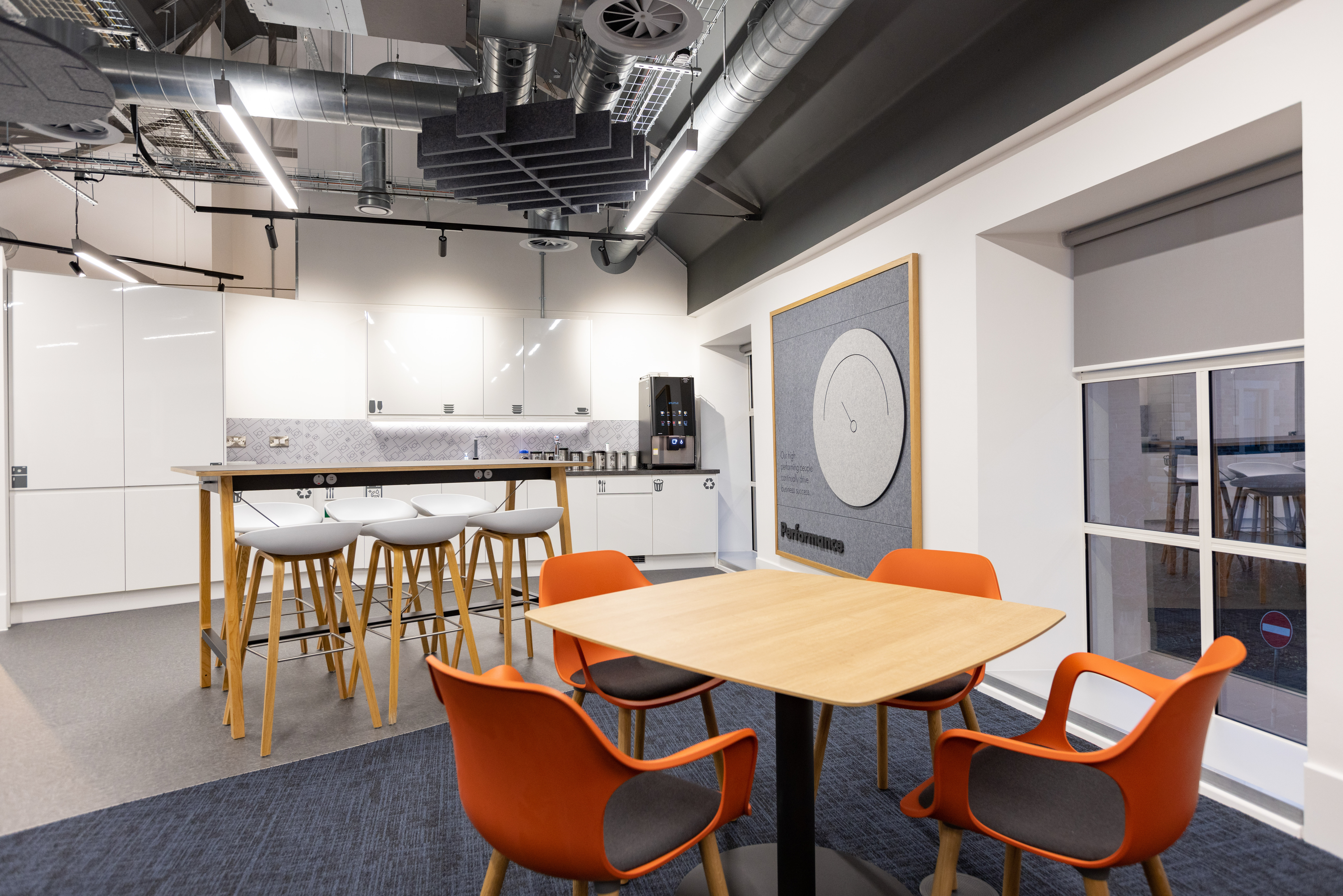
Whilst working in close consultation with the client it became apparent as the concept developed, that circulation around the building was restricted which resulted in a fragmented workforce. To remedy this a new café and breakout space was introduced providing a link between the reception and office space. In creating the new cafe area, we have provided informal places to meet as well as somewhere to eat lunch.
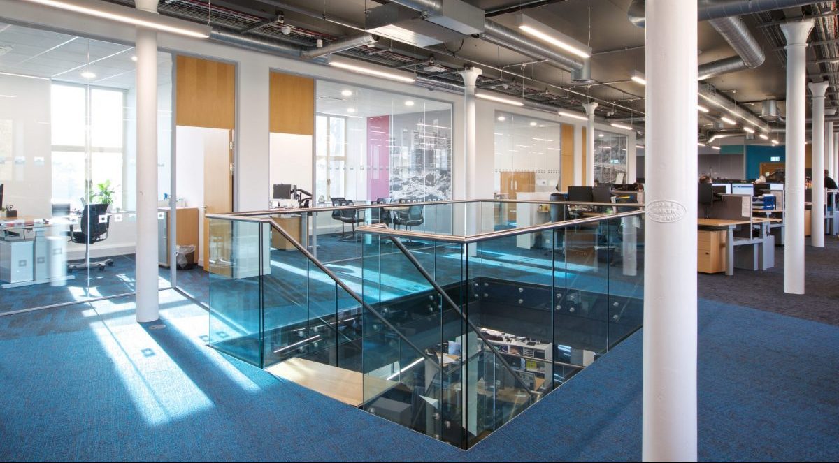
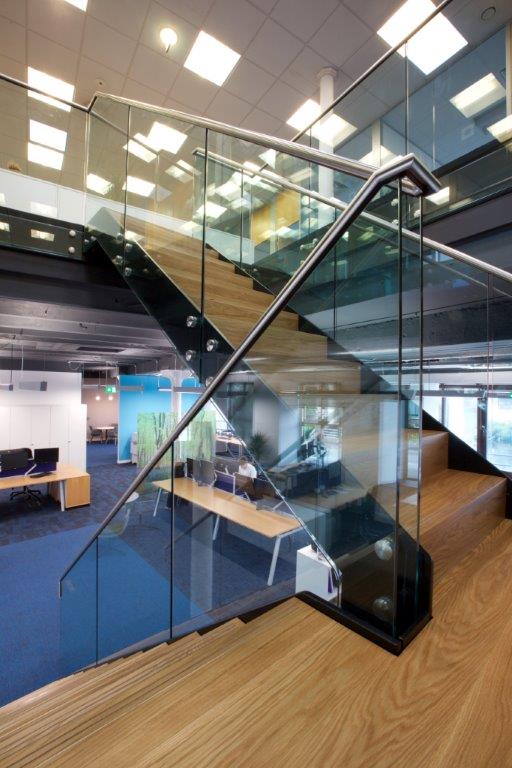
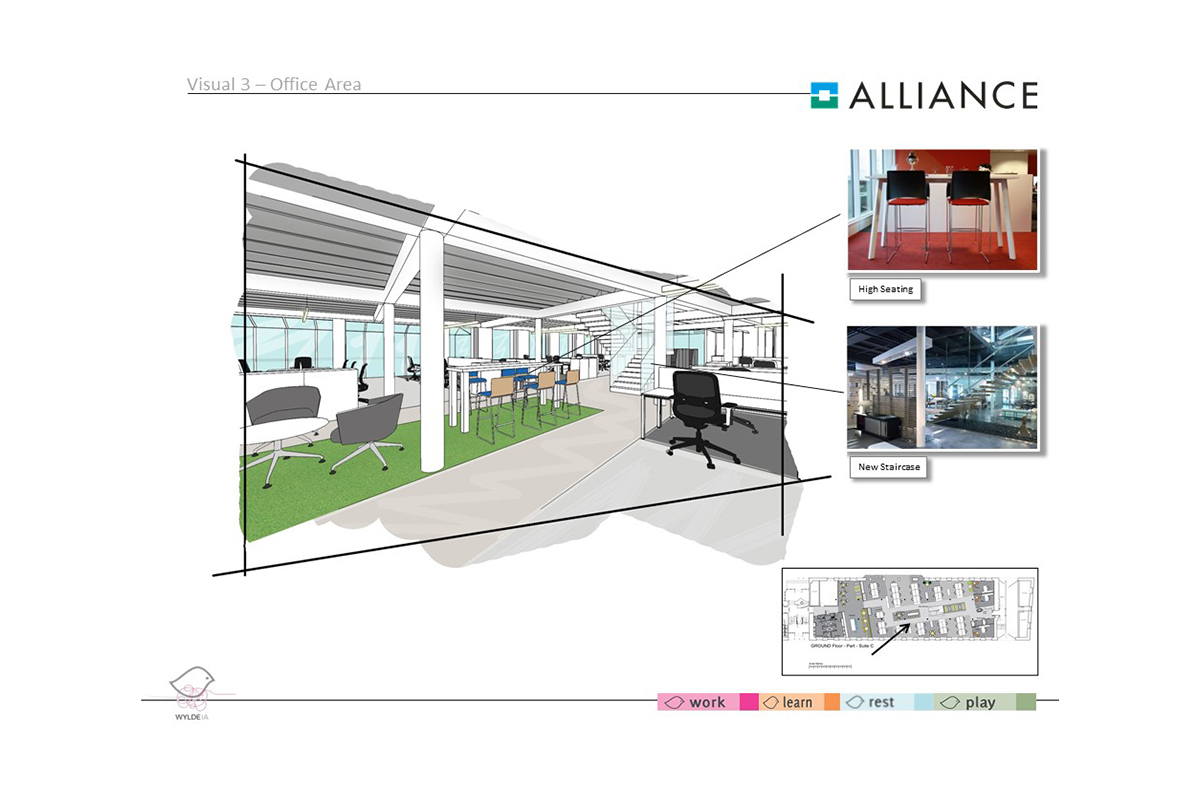
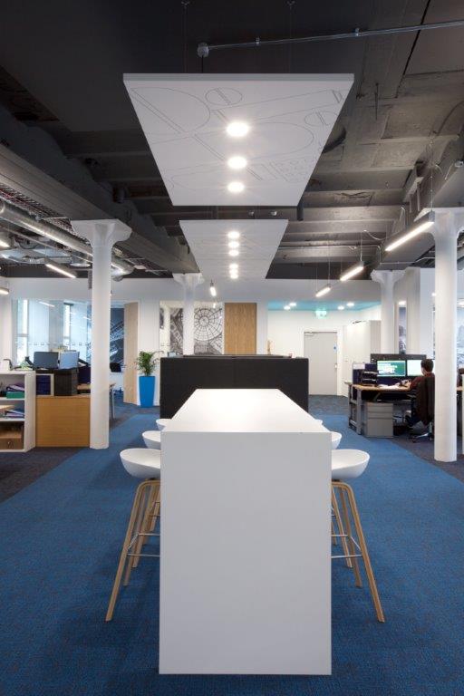
As a result of the success of this area, we are now removing closed meeting rooms on the first floor. We have exposed the old structural ceilings and columns, the new staircase made of powder coated steel and glass has reference to the buildings historical heritage.
We redesigned the area, positioning a new central staircase made from powder coated steel and glass which visually and practically links both floors. We did this by utilising existing ‘holes’ within the structure originally used for vats when the building was previously used to produce Nestle powdered milk products.
In doing so we have exposed the original structural ceilings and columns referencing the building’s original industrial architecture and heritage.” Future plans include improving functionality and use of remaining suites, improving DDA into the reception area, removing the first-floor suspended ceilings and making better use of this new-found space and generally uncovering more of the building’s original features.
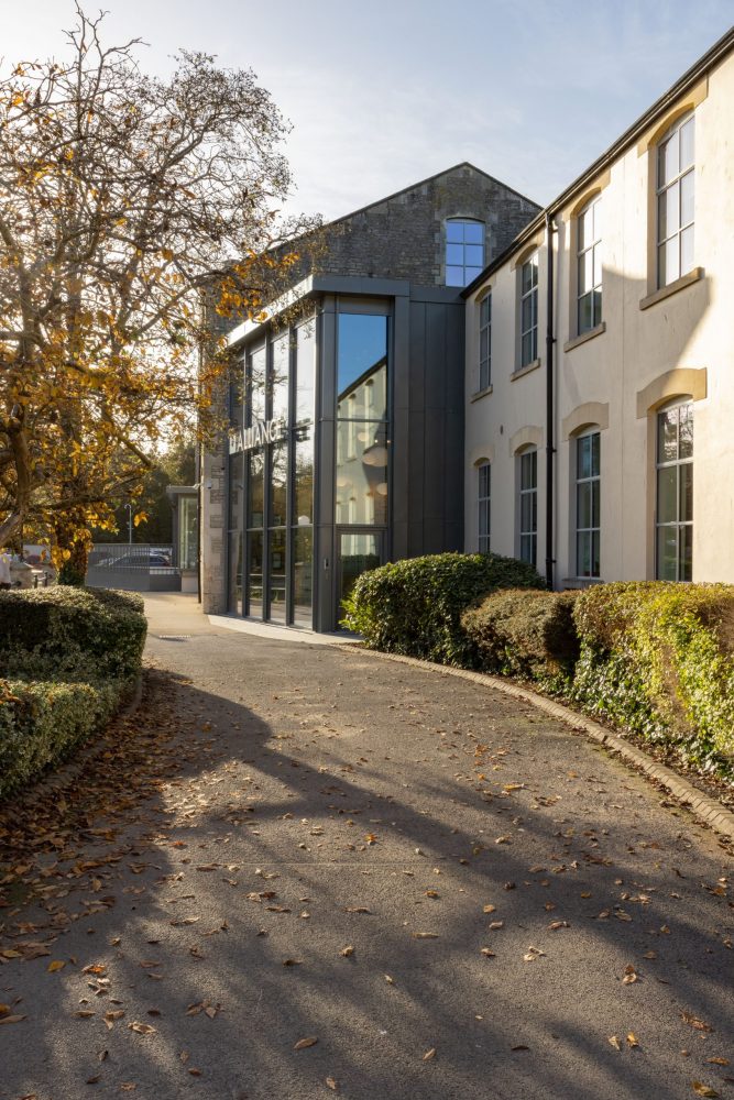
Having worked closely with the Alliance Pharma team over a number of years now, working our way through the Grade 2 Listed building, suite by suite, upgrading three work suites on ground and first floor levels. We recognised from the outset that the reception area would need revamping at some stage, but this was a long way down the list of things to do, prioritising the working areas over reception. Ultimately the existing curtain walling to the atrium and terrace dictated the timescale for the final part of the puzzle, as it became leaky and a liability to maintain. Finally, during 2021 we completed the last project, creating a new stand-out double height reception area and a new meeting suite and lounge on the first floor.
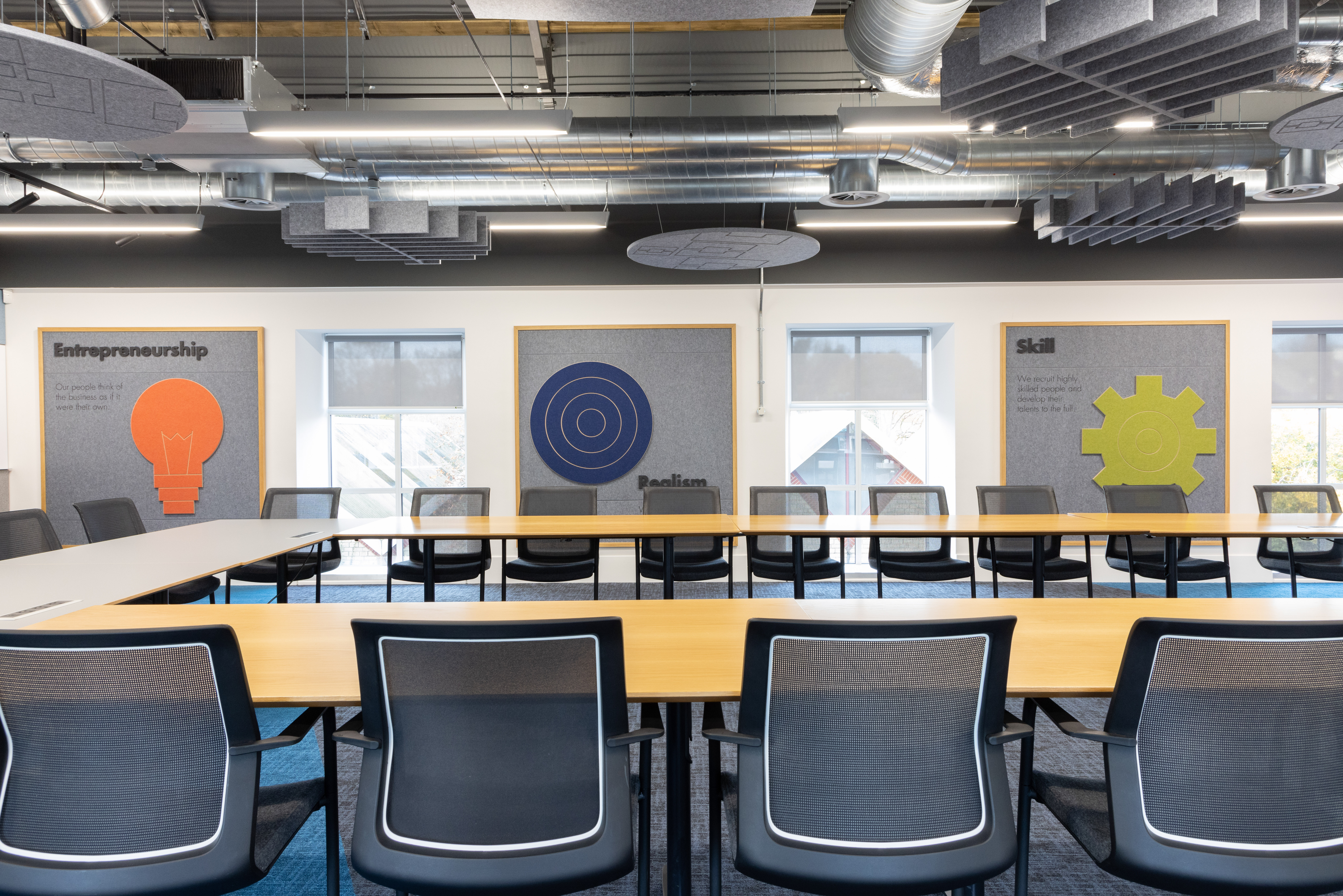
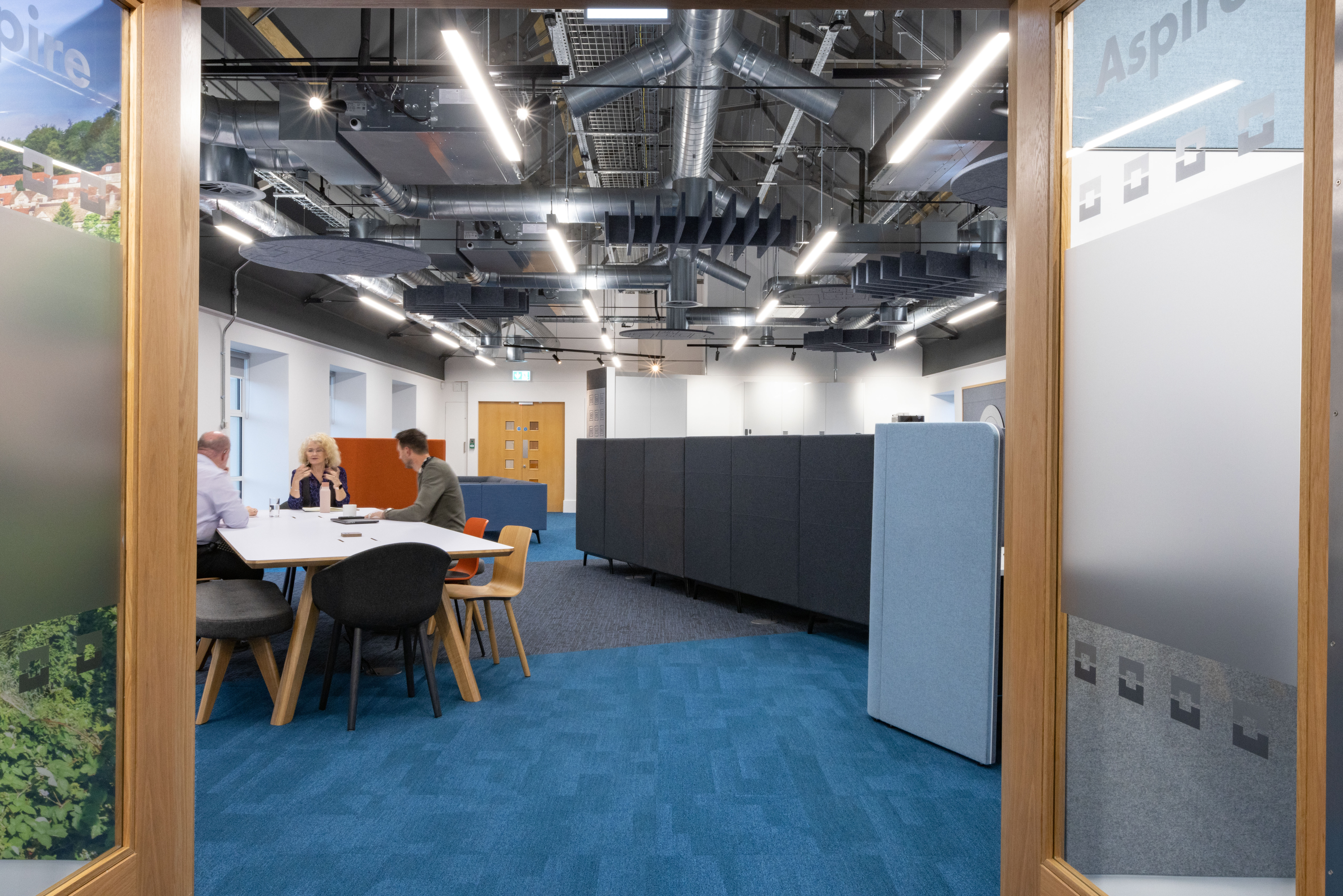
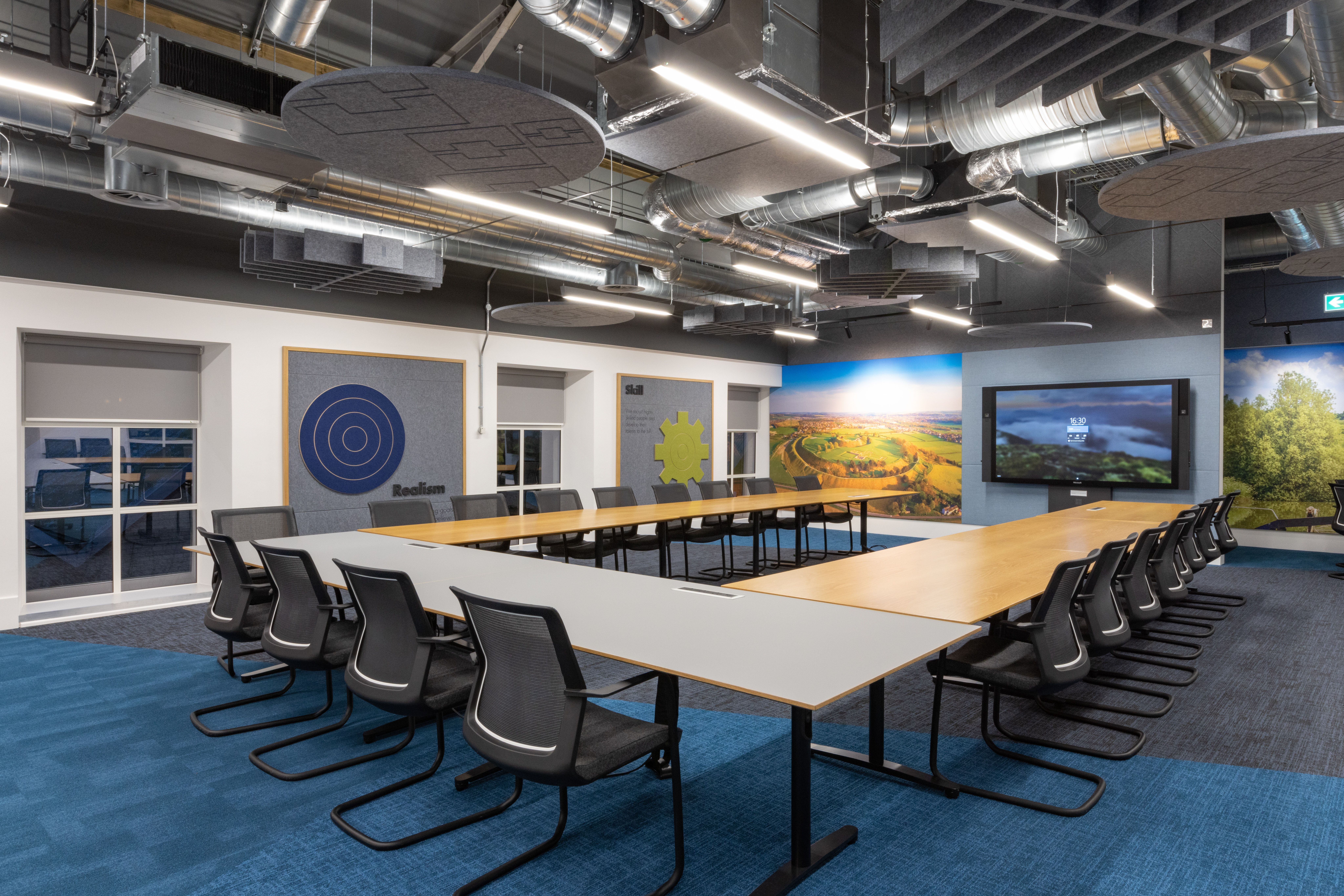
The lounge was inspired by lockdown and the desire to attract staff back to the office. The brief was to provide a modern collaboration suite in the old traditional 2,700sqft meeting space. We gutted the whole suite, exposed the old structure and created a large vaulted area that divide into a meeting facility and lounge space. It has a mix of different settings that can either be used on an individual basis or the whole suite can be booked for a team to use.
The result is gorgeous, warm and inviting. The vaulted roof allows space for the mechanical and lighting scheme to nestle at high level in the eaves, the effect is sculptural and dramatic> We’ve mixed branded acoustic materials in amongst the plant and ductwork, the walls are lined with acoustic material to help with noise transmission across the space. Concurrently we also designed and developed the new double height atrium and external terrace, which now gives better continuity and harmony with all the other refurbished areas of the building, we previously designed.
Each suite has a slightly different personality, but in each space, we’ve retained as much of the existing building fabric and structure as possible, harmonising this with new elements, such as a new linking staircase between the two main suites., colours, finishes and materials consistently link every part of the building together, branding and photography reinforces this too.

