This week we’re looking at one design concept that makes us all feel happy inside. Ever wondered what it is that makes up the ideal ‘feng shui’ of a room? When we walk into a well designed space we immediately feel comfortable, there is thought-out proportion in good interior design. A carefully considered interior design scheme is balanced – the furniture, textiles, colour palette and features are all in harmony.
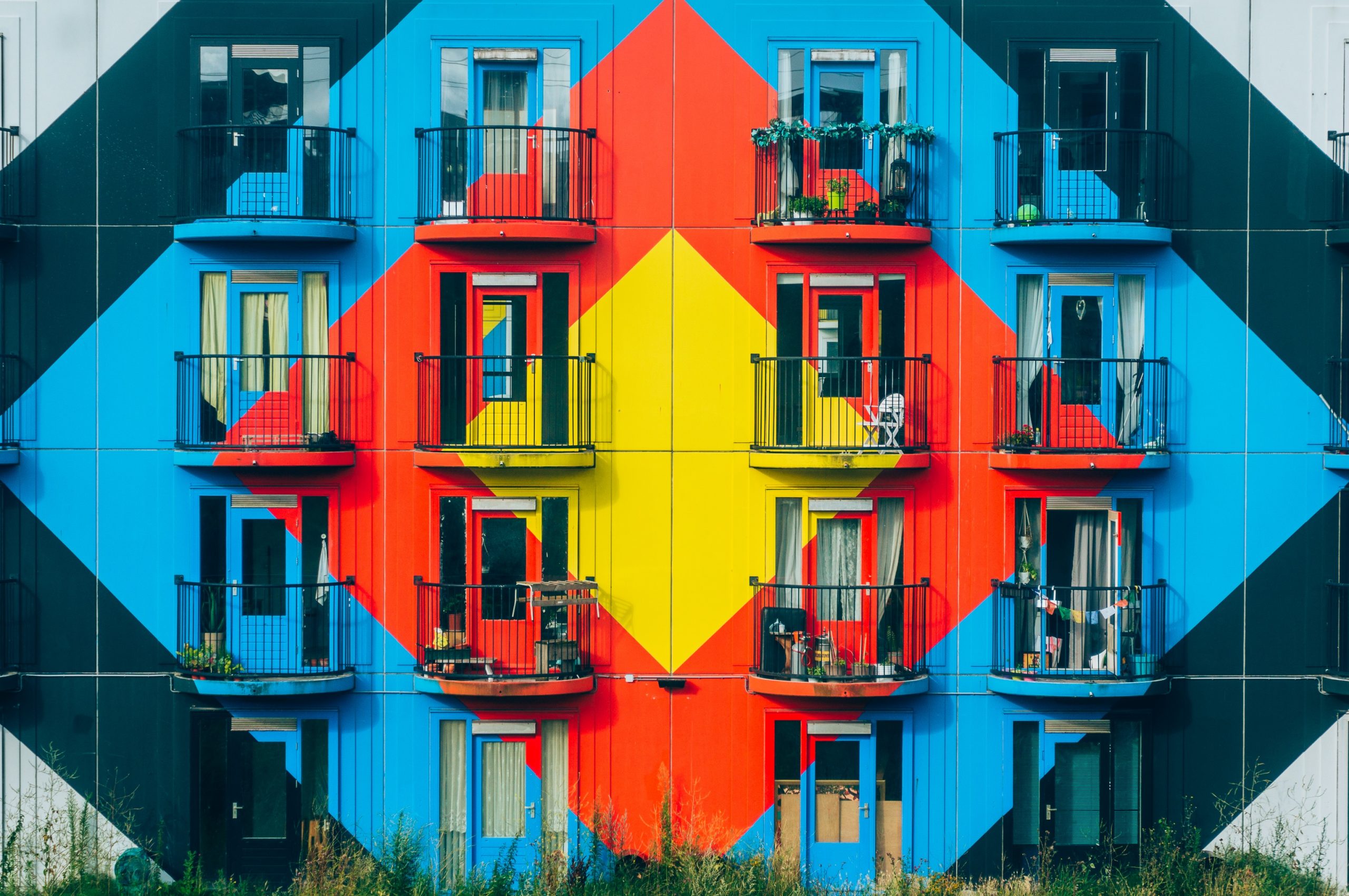
In fact, it may not always occur to us when complimenting a space, that we’re actually drawn to the symmetry of the area. It’s not that every room has to mirror itself on either side – but it should be made up of elements or components that flow. Way-finding and layouts are a huge part of our role as interior designers – we make the space human and human beings respond to symmetry.
Symmetry when it comes to design can be implemented in a variety of ways; the first that springs to mind is mirroring – often utilised in hotel design schemes, particularly the bedrooms. Mirroring creates an immediate sense of balance, with it being easier for our brains to process. Symmetrical interiors create a relaxed atmosphere because our brains don’t have to figure out the space as we know the set up is the same on both sides.
Other ways of introducing symmetry or balance into a space could be rotational, transitional and asymmetrical. Rotating objects around a focal point or creating a sense of direction with repeating features or patterns can transform a place – these usually work when when working with a lot of open space! Also using a break in symmetry to show off a centre piece, statement furniture or artwork/branding focal point works wonders!
It’s been proven that we rank symmetrical spaces as more attractive – but it’s important to achieve a sense of place or brand identity whilst included all the necessary components for the optimal functionality and fulfilling the clients brief. But hey, we can’t give you all our secrets!


