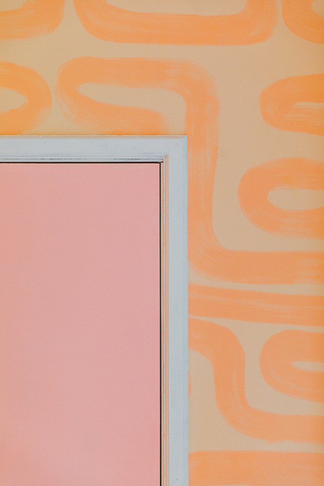
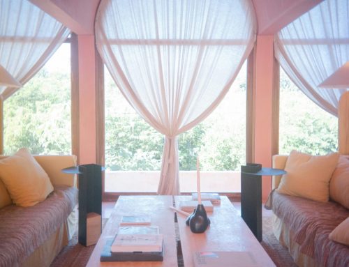
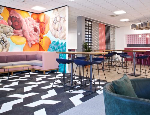
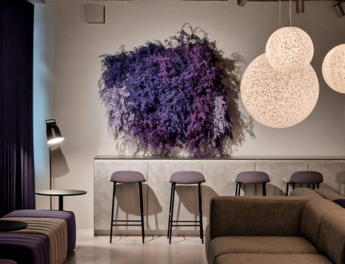
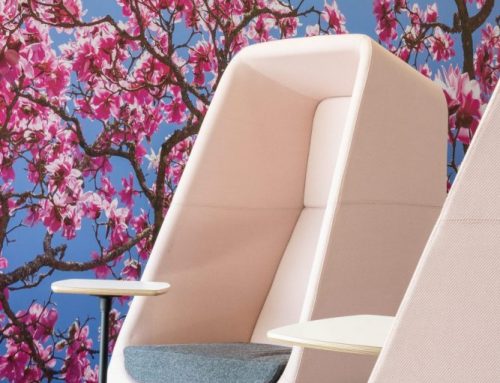
This week in the Wylde blog we’re talking about bright interior design with sunshine hues and golden glows. From warm browns, to burnt oranges and yummy yellows – a pop of bright colour could be the transformation from spring to summer for your interior scheme. We love a daring colour palette at Wylde, and opt for the unconventional wherever the design allows it so we’re here to encourage some sunny accents and pops of summer into your scheme.
Feeling nervous? You don’t have to paint your entire house orange to brighten up your interior design – colour accents are trending in a big way this summer which means affordable and easy transformations are here! For the minimalists amongst us, you can introduce colour into your space without losing the simple, clean aesthetic. Whilst most of us think of white spaces when we hear the word minimalism, colour and minimalism can (and does!) exist.
Our suggestion for a minimalist summer revamp is to pick a bright colour and use it carefully throughout a single space – from cushions to picture frames or even the flowers or plants you’ve got in the space. For a softer look, “Ice Cream colours” are very popular, think playful pastels and chalky yellows. Still feeling overwhelmed? Fear not – a contrast of a mostly simplistic space with one element bright colourful feature can be a way to create a focal point whilst not stepping too far out of the monotone lovers comfort zone!
Feeling daring? When it comes to painting feature walls here’s everything you need to know about the colour psychology behind each sunny colour.

